
Designed for Ramsay staff who manage the Pre-Admission and Admission processes (known as Admins), the pilot focused on improving clarity and efficiency in their daily routines.
OVERVIEW & GOALS
The primary goal of the Admin Hub Refresh was to introduce a clear and actionable task list, allowing Admin staff to easily see what needs to be done and when. By improving task visibility, the new design streamlines workflows and helps staff stay organised, focused, and confident throughout their shifts.
This was a pilot project that spanned approximately five months of design and development, followed by a two-week trial in two hospitals. (Spoiler alert: the system is now set to roll out across 40+ sites throughout Australia.)
Role
UX/UI Designer (Lead)
Team
2 Service Designers
1 UX/UI Designer 🙋♀️
1 Business Analyst
1 Developer
1 Process Analyst
1 Change Coordinator
1 Product Manager
Scope
• Task List
• Admission List
• Admission Dashboard
• Patient Search
• Patient Dashboard
Methods
Workshops, Surveys, Affinity Mapping, Research Analysis, Journey Mapping, Impact Effort Matrix, Sketching, Prototyping.
Tools
Pen & Paper
Miro
Figma
Our brains! 🧠
Project Type
Client project / Healthcare
Discover
How we found out
The Admin Hub Refresh was one of the outcomes of the “Good to Better” research initiative, conducted internally across Ramsay Health Care sites throughout Australia. One of the key pain points identified was the unclear indication of the next task to be completed. This caused administrators to spend more time on admissions and feel uncertain about which processes and tasks were still pending. This led to rework, delays, and reduced operational efficiency, negatively affecting the overall user experience.
Methods: Interviews, workshops, refinement sessions, and working group discussions.
Jump to Discover
Define
How we made sense of it
After the research findings were shared, our project squad worked collaboratively to explore possible solutions to the pain points identified.
One of the key opportunities discussed was the creation of a clear, structured task list to guide users through patient admissions. This would address the confusion around pending actions and streamline the process into a more reliable and consistent workflow across hospitals.
We aligned on a set of short-term improvements that could deliver immediate impact while laying the groundwork for larger transformational changes planned for Admin Hub 2.0.
Methods: Interviews, workshops, refinement sessions, competitor analysis and working group discussions.
Jump to Define
Solution
What we delivered
Design and documentation including:
• Feedback synthesis from interviews and workshops with admin staff to inform design decisions and prioritisation;
• Updated user flows and UI for the task-based way of working, including the Task List, Admission List, Admission Dashboard, Patient Search, Patient Dashboard, and more;
• Design patterns aligned with accessibility and internal usability guidelines;
• UX reviews with developers and BAs to ensure proposed solutions met expected outcomes within technical and resource constraints;
• Pilot solution prepared for testing at two sites;
• On-site pilot support and feedback rounds post-implementation;
• Iterations and enhancements leading to rollouts across 50+ sites in Australia.
Tools: Miro, Figma, Appian
Jump to Solution
Discover
• Insights from “Good to Better” research
• Brainstorming sessions with the squad
• Refinement sessions with the design team
• Alignment sessions with the business
What we found out
Before diving into the redesign of the Admin Hub, we leveraged insights from a previous research initiative titled “Good to Better”, led by Service Design.
This research was prompted by recurring user feedback around the usability and efficiency challenges of the existing Admin Hub, highlighting a clear need to improve the design, functionality, and workflows.
While broader research and design efforts for the future Admin Hub 2.0 had already been endorsed, this early discovery phase focused on understanding the current-state pain points and identifying quick wins.
These quick win opportunities aimed to ease immediate frustrations without relying on long-term transformation work that was still being scoped.
Findings from this phase laid the groundwork for the next steps of the project, including user interviews and prioritisation of opportunities. They provided a strong foundation to ensure we were solving the right problems — at the right time.
As you can see, we uncovered fertile ground for opportunities, which were divided into nine main themes. With so many insights on the table, our biggest challenge became refining these pain points and aligning them with the time and resources available for solution delivery.
Low awareness of features & fixes
Users don’t have a comprehensive understanding of the functionality available through Admin Hub.
1
Difficulties finding work
Admin Hub is not intuitive for identifying new admissions, outstanding actions or amended details.
2
Communication & visibility of actions
Admin Hub does not support interdepartmental collaboration or communication about admissions.
3
“It’s slow”
Admin Hub gives users the impression it is slow, both in general and compared to previous methods.
4
Usability & interface design
The layout of some features does not effectively use space or consider the user’s line of sight.
5
Redundant steps & clicks
Actions that could be grouped or automated are currently separated into multiple steps/clicks.
6
Matching data & fixing errors
System dependencies require users to validate and “clean” data, adding extra work and mental strain.
7
Unreliable data mapping
Perceived unreliability of Admin Hub’s integration with Meditech leads to duplication of effort through repeated checks.
8
Process & adoption
Inability to fully adopt Admin Hub as the source of truth creates variability in processes across users and sites.
9
It was understood that theme #9 Process & Adoption was a reflection of all the others. The challenges in transforming Admin Hub into a true source of truth for pre-admission processes.
One key insight that stood out was the need for a clearer workflow to help users organise their daily tasks and track what still needed to be actioned — without having to rely on memory, manual notes, or legacy systems. This opportunity resonated strongly across multiple themes and quickly emerged as a strategic focus for the next design phase. By improving how work was visualised, prioritised and completed, we could start shifting Admin Hub from a passive inbox to an active, user-centred workflow tool.
During one of these sessions, the team used the Job Stories method to reframe user needs based on their context and motivations, helping everyone align around problem statements grounded in real-life scenarios.From this activity, the squad defined the following problem statement, which guided the next stage of ideation and four early ideas emerged that started to shape what a future solution could look like:
Once Tasks are standardised/delivered consistently, apply Process Mining and Automation to remove as many Tasks as possible from Admins.
Simplified and standardised way to view and assign tasks for admins to standardised processes across hospitals
Combine task management with CRM to enable Admin to have a single source of truth of all patient interactions and the status of each admission
Focus on simple, intuitive and accessible interface design and smart, automated logic to anticipate which tasks a user should complete next
These ideas reinforced an opportunity that was already gaining prominence — the implementation of a task-based way of working. At this point, I was brought into the squad as the dedicated UX Designer to lead the design efforts in close collaboration with Service Design.
Together, we began shaping a proof of concept that could demonstrate the potential of a more structured, task-focused experience — one that would guide users through their daily workflow, reduce ambiguity, and support site-specific needs without adding unnecessary complexity.
This was a highly collaborative process, with UX and Service Design working closely with the Product Manager, Developer, and Process Analyst to co-create early wireframes and user flows.
Design refinement workshop – aligning on user needs and task flows

A collaborative mapping session with Service Designers and UX was held to refine key user needs, identify workflow gaps, and align design priorities. This activity helped bridge insights from discovery into actionable features and experience principles.
Competitor Analysis
Once we had identified the opportunity to introduce a task-based way of working, we turned to the market to explore how other tools structure and visualise task management.
The goal was to gather inspiration and assess design patterns for status, priority, colour systems, and overall clarity.
These insights helped shape early design directions by highlighting best practices in interface simplicity, hierarchy, and scannability. Here are some examples:

Most well-rated tools prioritise clarity, with minimal visual clutter, effective use of subtle colour palettes, and clearly structured layouts. Features like side menus, colour systems, and priority tags stood out as good practices to reference in our own product design.
SME’s & Admins Workshops
To refine and validate key concepts, we facilitated 5+ workshops with two distinct groups: Subject Matter Experts (SMEs) and Admin staff, our end users.
During these sessions, we presented the problem space, key opportunities, and project objectives. We also introduced the idea of a task-based way of working, explaining the concept and its potential benefits, shared early mockups, validated workflows, and gathered a wide range of feedback, from task naming and wording (with a focus on familiar, accessible language) to detailed insights that helped shape our Proof of Concept, which later evolve into a pilot across two hospital sites.
Problem
Today Ramsay Admin teams have to spend time preparing, organising and anticipating tasks across multiple sources when they simply want to focus on completing their work and ensuring every patient is supported.
Opportunity
Simplify and standardise the way Admins manage their workload and enable them to keep track of all their tasks in a single place.

Involving users in the co-design of the new system allowed us to gain a deep understanding of local workflows and the unique characteristics of each site. For example, we learned that larger teams tend to divide tasks by worktype, with individuals becoming specialists in specific parts of the process. In contrast, smaller sites usually have Admins managing the full end-to-end process for a single patient, requiring a more generalist approach.
Task List
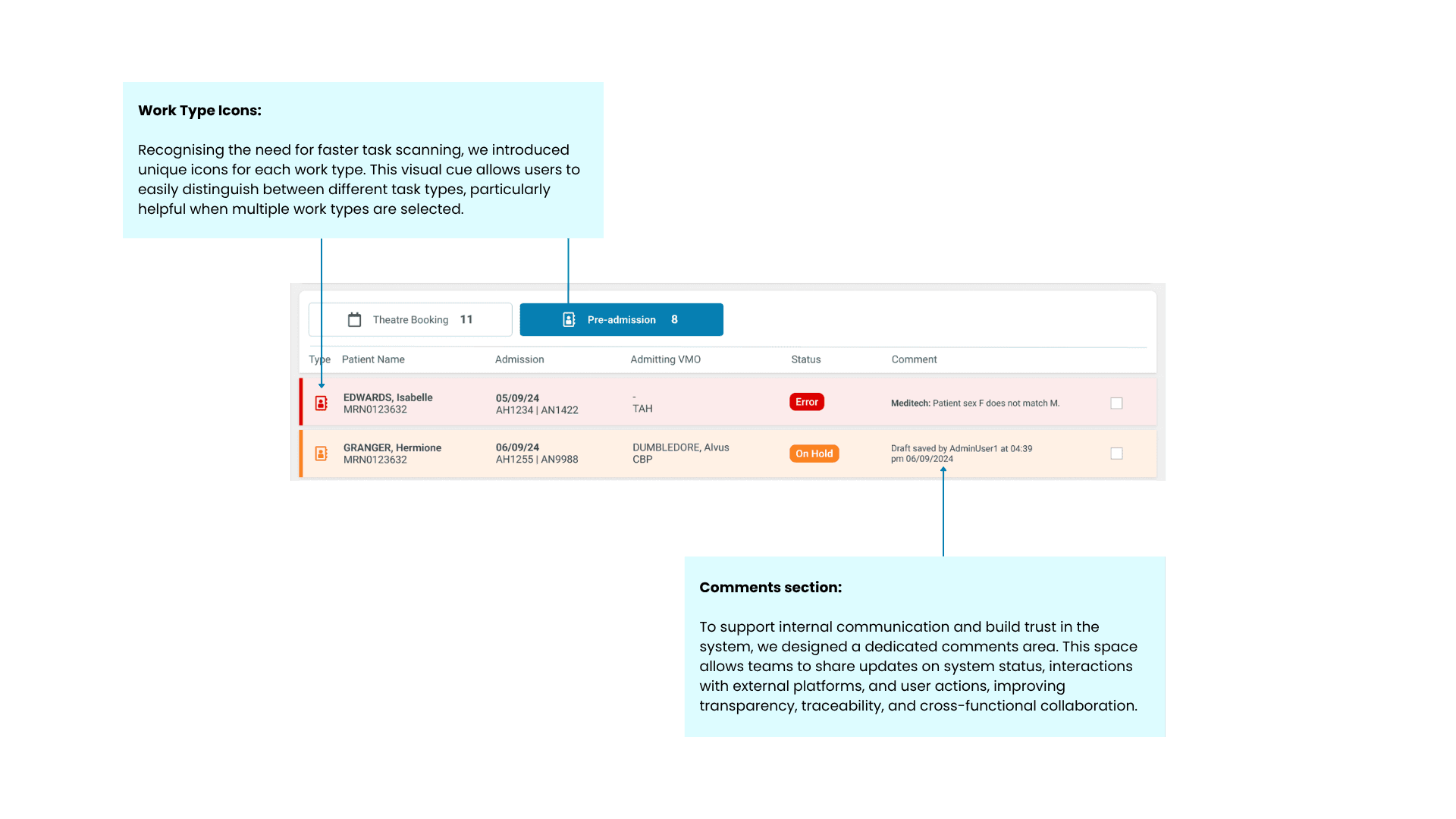
The task list plays a central role in the Admin Hub, acting as the primary interface through which admin staff manage their daily workflows. By consolidating tasks into a single, prioritised view, it offers greater visibility, reduces cognitive load and supports more efficient task execution.
A well-designed task list not only helps staff stay on top of time-sensitive actions, but also enables better team coordination and workload distribution across different roles and responsibilities. For many users, it became the anchor point of their day, helping them navigate complex admission and pre-admission processes with clarity and confidence.

Admission List
Previously, it was used primarily for the pre-admission process, but it has now been repurposed for the admission process. The goal is for front office users to use this screen to verify that all prior steps have been completed and to resolve any outstanding issues with the patient at the time of admission.


Admission Dashboard
The Admission Dashboard serves as a central hub for all information related to a patient’s admission. However, many users reported not using it due to a lack of awareness about its features and a lack of clarity in the UI.
We redesigned the dashboard to be cleaner and more intuitive, consolidating open and completed tasks, attached documents, and improving visibility of data from forms. It now also includes includes the full activity history within the system, offering a comprehensive view of the admission stage.


Patient Dashboard
Another key need identified was the lack of access to a patient’s past admissions. This limitation not only prevented users from reviewing or reusing previous information but also made it impossible to see the full admission history of a patient.
To address this, we introduced the Patient Dashboard, which consolidates all admissions related to the same patient. This includes both past and upcoming admissions—provided the pre-admission process has already started—as well as any outstanding tasks related to those admissions. The dashboard offers a centralised view that supports better continuity of care and streamlines task management across episodes.

Pilot Feedback
We established a structured follow-up plan for the pilot, divided into three key phases. The first phase took place during the initial week of usage, involving one-on-one online interviews with users from both sites to gather early impressions. The second phase occurred at the beginning of the second week and included on-site visits, interviews, contextual inquiry, and shadowing. The third phase could have involved group online sessions with users from both locations to collect general, open-ended feedback and suggestions for improvement, but this stage was not carried out due to challenges with user availability.
The pilot was conducted at two sites with different outcomes. The first, a smaller site, reported high satisfaction with the new system while still offering constructive feedback and suggestions for improvement. The second site, with a larger team and a higher volume of daily admissions, initially welcomed the redesigned workflow and recognised the improvements but ultimately reverted to the old system due to performance issues.
The combination of slow system response times, unfamiliarity with the new workflow, and high operational pressure led to difficulties in adoption. However, during user interviews, it became clear that if performance issues were resolved, users would be willing to adopt the new system more broadly, as they saw more benefits than drawbacks.
Users also highlighted opportunities to streamline the Pre-Admission process by consolidating work types and reducing task fragmentation. There was strong support for integrating external systems into Admin Hub Refresh, helping to reduce context switching and simplify daily routines.
These insights provide a strong foundation for future iterations. With a clear prioritisation strategy focused on performance optimisation, task flow simplification, and smarter system integration, the Admin Hub Refresh proved successful in laying the groundwork to boost adoption, user confidence, and overall productivity across different hospital settings.
Post-pilot Iterations: Enhancements
Following the pilot release, we went through a period of evaluation and prioritisation, where key friction points and improvement opportunities were identified and prioritised. Several enhancements were then introduced based on user feedback and observed challenges. Some of these included:
Performance
Identified issue: Slow loading times were flagged as the main barrier to adoption.
What we did: The tech team prioritised performance optimisation, implementing backend and frontend improvements to reduce load times.
Impact: Sites reported noticeable improvements in speed, resulting in time savings and increased efficiency across admission workflows.

Status Icon Set Review
Identified issue: We found at least 13 different icons representing task statuses or stages in the pre-admission process. The variety and subtle differences made it difficult for users to quickly understand their meanings.
What we did: Conducted an extensive review and validated with users to reduce the icon set to four core icons. We also added a clear legend and revised the hover messages to provide a secondary layer of detailed information when needed.
Impact: Improved at-a-glance comprehension of pending tasks versus those requiring no action, reducing cognitive load and supporting faster decision-making.
Cancellation Task
Identified issue: There was no clear visibility over admission cancellations requested by patients or VMOs through the portal. Admin staff had to cross-check multiple systems, including email, to confirm cancellations, often continuing to process tasks unnecessarily.
What we did: A new work type was introduced to represent “Admission Cancellation” requests, making them clearly identifiable within the task list.
Impact: Reduced wasted effort, minimised the risk of processing invalid tasks, and improved trust in the system’s data.
Sorting by Doctor
Identified issue: Admins frequently needed to contact doctors during task execution. Without grouping, tasks linked to the same VMO were scattered, resulting in repeated and inefficient communication.
What we did: We introduced a sorting option to group tasks by doctor.
Impact: Enabled streamlined communication, allowing staff to batch queries and reduce interruptions, ultimately boosting productivity.
Combining Payment and Claim Form Tasks
Identified issue: Payment and claim form tasks were often completed together, and sites expressed a preference for automating and consolidating these steps — including the patient notifications sent through the portal.
What we did: These tasks were combined into a single interface and automated where possible, based on site preferences.
Impact: Reduced manual work for Admins, streamlined the patient experience, and helped ensure clearer, more consistent communication through the portal.
These examples illustrate the continuous evolution of the Admin Hub Refresh, which over the following five months was rolled out to more than 50 sites across the network. Concurrently, the project team maintained a strong focus on identifying further enhancements, aiming to maximise user satisfaction while aligning with evolving business priorities.