Sensory-Led Dark Mode
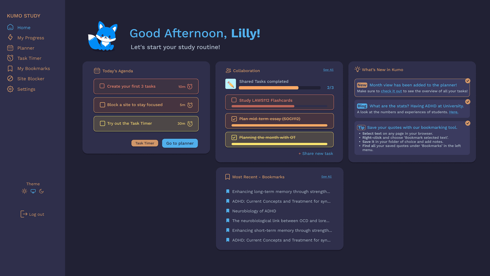

Kumo Study is a browser extension designed to support ADHD students in managing their study routines — tasks that rely heavily on executive functioning, working memory, and sustained focus.
These are precisely the cognitive areas most affected by ADHD. The interface that carries these functions cannot be neutral. Every visual decision either reduces or adds to the cognitive load the user is already managing.
OVERVIEW & GOALS
When we talk about dark mode in mainstream design, the conversation tends to orbit battery life and visual preference. For neurodivergent users, however, that framing misses the point entirely. Sensory sensitivity to light is a documented characteristic of ADHD and related conditions — not a stylistic concern, but a functional one.
It affects how long someone can sustain attention, how quickly fatigue sets in, and whether a tool feels like support or friction. Designing dark mode for Kumo Study meant engaging with that reality from the start.
It is also worth acknowledging what kind of tool Kumo Study is. This is not a content consumption platform, where a user might scroll passively for a few minutes before moving on. It is a study environment — a space students return to repeatedly, stay inside for extended periods, and rely on to manage the cognitive demands of academic life.
Role
UX Designer
Team
1 UX Designer (me! 🙋🏼♀️)
1 Developer
Scope
End-to-end
3 week design sprint
Methods
Domain Research,
Sketching,
Wireframing,
Prototyping.
Tools
Pen & Paper
FigJam
Figma
Miro
Our brains! 🧠
Project Type
Client project
Discover
How we found out
The process began with a review of existing research on ADHD, sensory processing and visual attention, combined with feedback collected from users and logged in our backlog across different stages of the product. This allowed us to build both a scientific and experiential understanding of the problem — grounding design decisions in neurological evidence while staying connected to what users were actually reporting in their day-to-day use of the tool.
Methods: Domain Research, Surveys, Affinity Mapping.
Jump to Discover
Define
How we made sense of it
We identified that the core opportunity was not simply adding a visual theme, but designing a colour system that genuinely served the sensory needs of people with ADHD. Most dark interfaces on the market default to high-contrast, high-saturation palettes — effective for general audiences, but potentially overwhelming for users with light sensitivity. That gap became our design brief.
Methods: Accessibility Audit, Sketching, Prototyping.
Jump to Define
Solution
What we delivered
Design and prototype documentation including: a dark mode colour system built on a palette of soft, muted tones, tested and confirmed at WCAG 2.2 AA compliance; an updated plugin UI applying the theme consistently across components; and accessibility annotation documentation recording contrast ratios and colour usage guidelines.
Tools: Figma, Stark
Jump to Solution
Discover
• Domain Research
• Surveys
• Affinity Mapping
How we found out
The process began with a review of existing research on ADHD, sensory processing and visual attention, combined with feedback collected from users and logged in our backlog across different stages of the product. This allowed us to build both a scientific and experiential understanding of the problem — grounding design decisions in neurological evidence while staying connected to what users were actually reporting in their day-to-day use of the tool.
Dark mode was not being requested as a trend — it was being requested as relief. One finding from the research challenged an early assumption: the instinct to use high-contrast, vivid colours in a dark interface to ensure visibility. The evidence pointed in the opposite direction. For users with sensory sensitivity, saturated or neon tones in a dark environment can be just as uncomfortable as bright backgrounds. The visual system is still being overstimulated — only from a different source.
Domain Research

What the evidence tells us
Light sensitivity is one of the most consistently reported but least accommodated characteristics of ADHD. A landmark study by Kooij and Bijlenga found that self-reported photophobia was present in 69% of respondents with ADHD symptoms, compared to 28% of those without — a striking difference that frames light sensitivity not as an edge case, but as a majority experience within this population.
The underlying mechanism is neurological. The eyes are directly linked to dopamine and melatonin production systems, both of which are involved in ADHD and circadian rhythm regulation (Get Inflow). This means that exposure to bright or high-contrast screens does not simply cause discomfort — it can actively interfere with attentional and regulatory systems already under strain in people with ADHD.
Sensory processing difficulties compound this further. Research suggests that up to 75% of individuals with ADHD experience sensory processing difficulties, including heightened sensitivity to light, which can worsen symptoms of anxiety, stress, and emotional dysregulation. For students using a study tool over extended periods, this is not a peripheral concern — it sits at the centre of whether the tool can function as intended.
A 2022 systematic review and meta-analysis reinforced that ADHD is significantly associated with a range of visual processing differences and disorders of the eye (Nature), reinforcing that visual design decisions for this audience carry clinical, not just aesthetic, weight.
From a UX perspective, the implications are direct. Neurodivergent individuals, including those with ADHD or sensory processing disorders, may find dark mode interfaces less overwhelming, with subdued tones creating a calmer visual environment that enables better focus (Profiletree). A 2025 accessibility report by See Me Please, drawing on repeated user testing cycles, found that dark mode was consistently the top accessibility request across organisations, often ranking higher than other commonly implemented accessibility improvements.
However, the evidence also introduces important nuance. Dark mode is not universally beneficial. While dark mode can improve readability and comfort for some users, it is not effective for everyone — individuals with astigmatism, for instance, may experience a halation effect where bright text on dark backgrounds appears to bleed or blur. This reinforces that the goal is not to replace one default with another, but to give users meaningful control over their visual environment. It also shaped a key design decision in this project: offering dark mode as an option, not a replacement.
Finally, research into colour and contrast within dark interfaces pointed away from high-saturation palettes. Accessibility in dark mode requires more than passing contrast checks — state visibility, focus indicators, and non-colour cues must all remain distinct, and the cognitive layer must be preserved so users are not forced to relearn the interface when switching themes (Influencers Time). For a user group already managing executive functioning demands, any additional reorientation cost is design friction that the interface should absorb, not distribute.
Now, please go back to the first paragraph of this section and compare it with the last one, and then answer: which was more comfortable to read?
User Feedback
Dark mode — or at minimum, theme options — has been a recurring request from our users for as long as I've been at Kumo. It first appeared in feedback during the earliest iteration of the product, nearly two years ago, and has resurfaced consistently ever since. In each prioritisation cycle, however, other features took precedence based on impact and effort considerations, and dark mode remained in the backlog.
It was our end-of-year survey in late 2025 that brought it forward again with enough weight to finally act on it — a reminder that persistent user needs do not disappear just because they are deferred.


• Problem Framing
• Accessibility Audit
• Sketching
• Prototyping
The Design Tension
Before moving into ideation, it was necessary to name the core constraint clearly — because it was not a simple one.
This question sits at the intersection of two legitimate but competing requirements:
Accessibility requirement
Sensory requirement
High contrast ratios (minimum 4.5:1) push toward bright, vivid accent colours
Bright, vivid colours overstimulate users with light sensitivity
WCAG AA is the non-negotiable compliance baseline
WCAG AA was not designed with neurodivergent sensory profiles in mind
Visibility must be unambiguous
Comfort must be sustained over hours, not seconds
The brief was not to satisfy one side of this table. It was to find the space where both could coexist.
How we made sense of it
Through analysis of the research findings and user feedback, we identified that the core opportunity was not simply adding a visual theme, but designing a colour system that genuinely served the sensory needs of people with ADHD.
From there, we prioritised decisions based on two criteria: WCAG AA compliance as a non-negotiable baseline, and visual comfort as the defining quality standard above it.
Inspirations and collaboration
Once it became clear that dark mode could not simply be a colour inversion — that it needed to be genuinely comfortable for long study sessions, actively reducing eye strain rather than just shifting the background — it was time to look for inspiration.
A detail worth naming in any honest case study is the role that collaboration plays. Having a team where ideas and references flow freely, where asking a question or sharing a half-formed thought is genuinely welcome, changes the texture of design work in ways that are hard to quantify but easy to feel. The development environment screenshots I requested came back quickly, accompanied by suggestions, curiosity, and a few references I had not considered.


Colour selection and principles

For colour validation, the Stark plugin was used. Initially, we tested a more saturated set of colours, focusing on AAA compliance.
However, we identified that it was necessary to soften these colours to reduce eye strain and ensure comfortable use of the platform for extended periods.
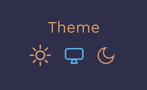
Theme choice should always belong to the user: the dark mode toggle was designed to be consistently accessible throughout the interface, with the added option to follow the user's existing system preference automatically.
Kumo Study uses colour intentionally — as a functional layer that helps students organise their routines, distinguish between tasks, and create visual anchors in what can otherwise feel like an overwhelming amount of information. That colour system needed to survive the transition to dark mode intact. It was not enough to find tones that worked against the new background in isolation; they needed to remain recognisable.
A task category that a student had learned to identify by its colour could not afford to feel like a different colour under a different theme.
The work, then, was not just contrast testing — it was translation. Each hue from the original palette was reinterpreted into a tone that respected the darker environment while preserving enough of its visual identity to keep the system coherent and familiar to returning users.

Dark mode colour system built on a palette of soft, muted tones — tested and confirmed at WCAG 2.2 AA compliance across all text and interactive elements;
Updated plugin UI applying the dark mode theme consistently across components, maintaining functional clarity for users managing executive functioning tasks;
Accessibility annotation documentation recording contrast ratios and colour usage guidelines to support future development and maintenance.
What we delivered
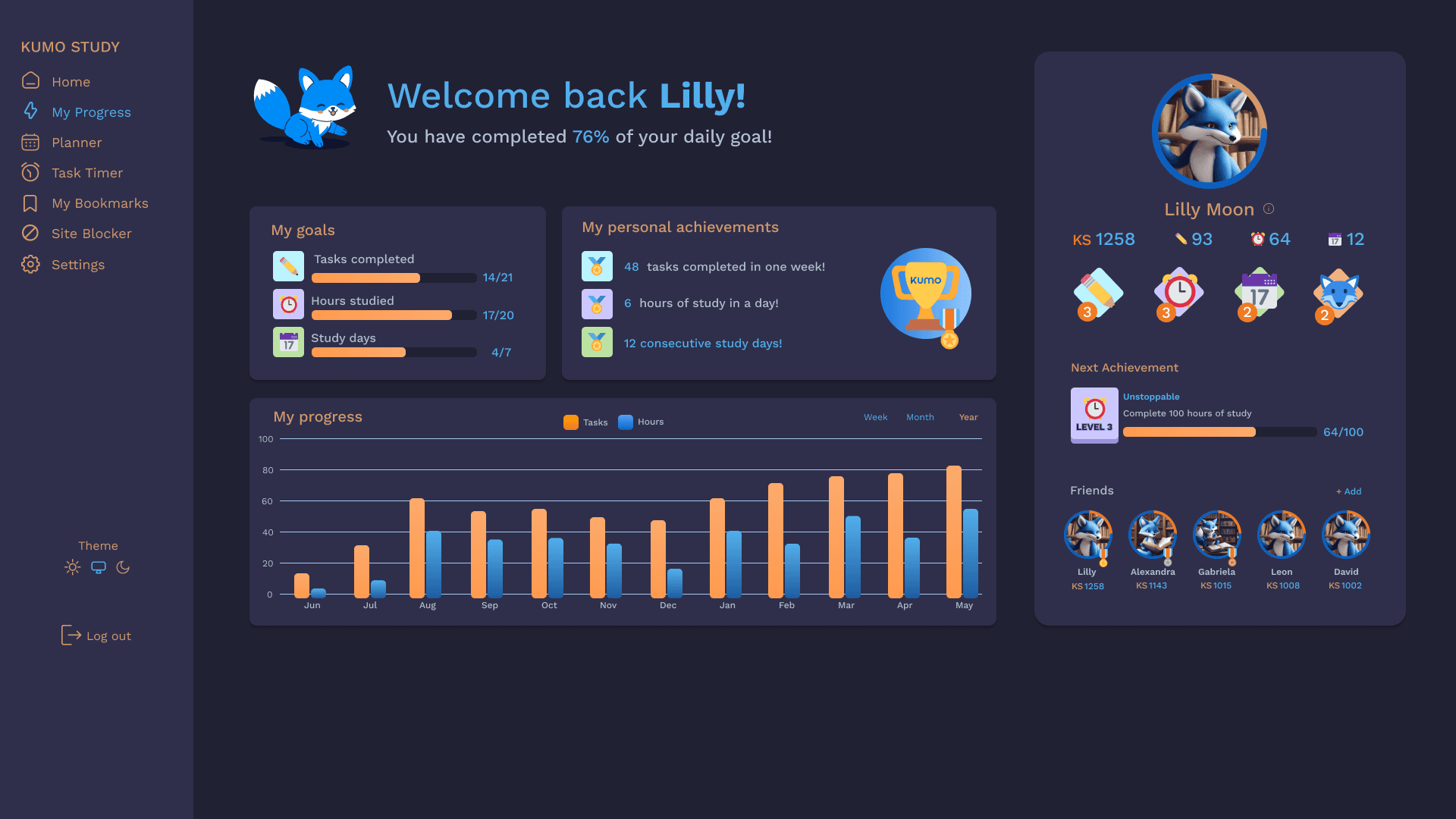
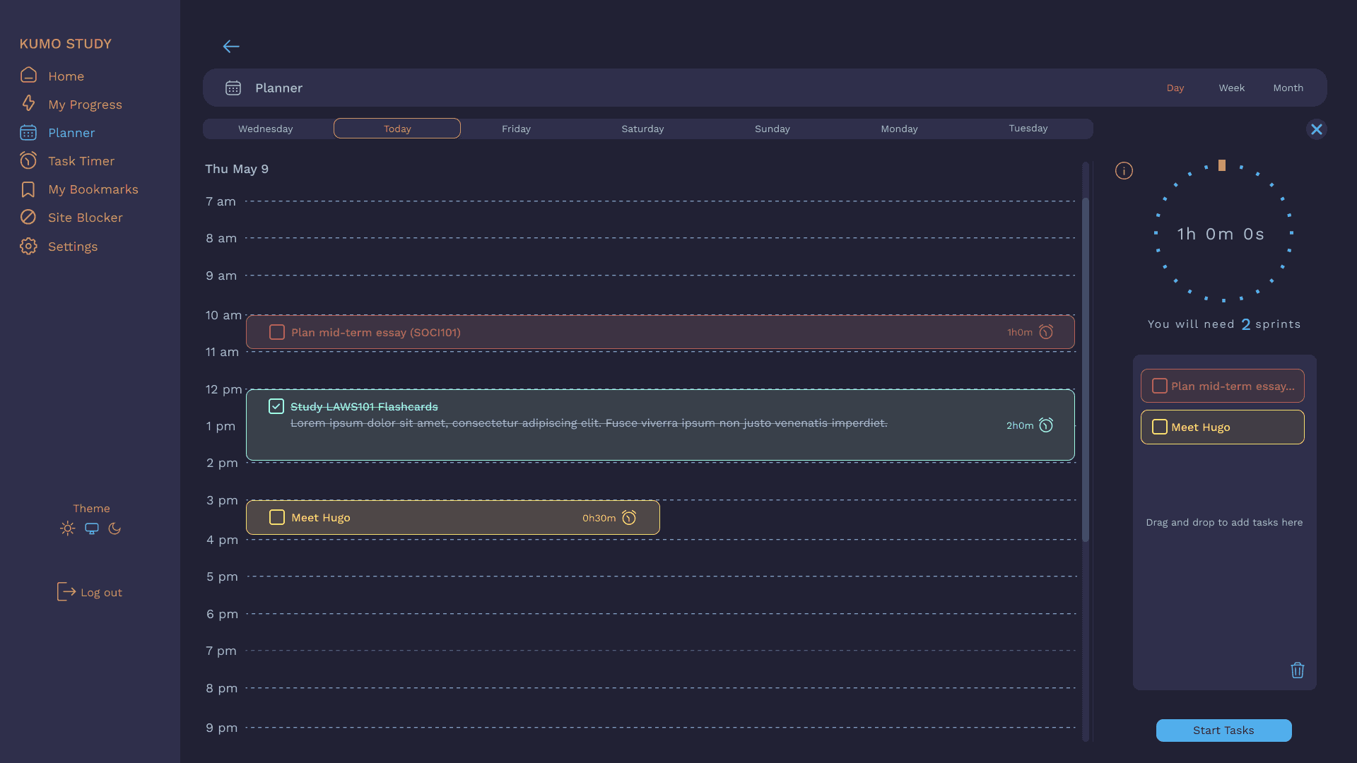
The solution centred on a restrained palette of soft, muted tones — what might be described as candy or dusty colours — applied within a dark background system. Rather than reaching for neon or fully saturated hues to achieve contrast, the approach was to control luminosity carefully: backgrounds dark enough to reduce overall brightness, foreground elements light enough to meet contrast thresholds, but always in tones that carry warmth or softness rather than intensity.
Each colour combination was tested in Figma using Stark before being confirmed. The process was iterative — a colour that read well in isolation often failed when placed in context alongside other interface elements, or when applied to smaller text sizes where contrast requirements are stricter. Several early candidates were discarded because they created subtle vibration effects against the dark background, a known visual phenomenon that causes discomfort in some users.
The final palette achieved WCAG 2.2 AA compliance across all text and interactive elements, while remaining visually calm by design. The result is a dark interface that asks less of the visual system — reduced luminance, reduced saturation, reduced contrast extremes — without compromising the clarity that executive functioning support tools depend on.
The new dark interface maintains the relationship with the original colours while adapting them to soft, comfortable but exciting and accessible colours on a dark background.



Reflection & Outcomes
Outcomes:
• Positive user feedback
Early feedback described the interface as feeling easier to stay inside, a meaningful signal for a tool designed to support sustained focus.
• Accessibility compliance achieved
All text and interactive elements passed WCAG 2.2 AA contrast requirements, validated through Stark. This positions Kumo Study as a more credible accessibility-first product, particularly relevant for partnerships with university disability and support units.
• Foundation for a scalable colour system
The soft-tone dark palette established through this project created a reusable design reference — contrast ratios, colour tokens and usage guidelines — that can support future feature development without revisiting accessibility decisions from scratch.
• Insights shaping the product roadmap
The gap identified between what WCAG compliance requires and what genuine sensory comfort demands has directly informed how accessibility is now framed within the product's design priorities, moving it from a checklist item to a core design criterion.
What I would do differently
The main limitation of this project was the absence of structured usability testing at the validation stage. Time constraints made broader user participation difficult, and that is worth naming honestly. The research base and survey data provided strong directional confidence, but longitudinal testing — tracking visual comfort and session duration before and after the dark mode was introduced — would have produced far more rigorous evidence.
Going forward, even lightweight in-product feedback mechanisms — such as a prompt asking users to rate visual comfort after switching modes — would close that gap meaningfully. This is something we are actively considering as part of Kumo's next research cycle. As a Co-Founder and the designer responsible for the product's direction, this project permanently shifted how I frame accessibility within our roadmap. It is no longer a compliance checkpoint that arrives at the end of a feature sprint. It is a design criterion that enters the room at the beginning — alongside user need, cognitive load, and functional clarity. deserves good inclusive measurement, and that principle now shapes how every new feature at Kumo is scoped, tested, and evaluated.